Label
Object Hierarchy:
Description:
The Label widget displays a small amount of text.
As the name implies, most labels are used to label another widget such as a Button, a MenuItem, or a ComboBox.
CSS nodes
label
├── [selection]
├── [link]
┊
╰── [link]If the label has a selection, it gets a subnode with name selection.
If the label has links, there is one subnode per link. These subnodes carry the link or visited state depending on whether they have been visited.
GtkLabel as GtkBuildable
The GtkLabel implementation of the GtkBuildable interface supports a custom `<attributes>` element, which supports any number of `< attribute>` elements. The `<attribute>` element has attributes named “name“, “value“, “start“ and “end“ and allows you to specify Attribute values for this label.
An example of a UI definition fragment specifying Pango attributes:
<object class="GtkLabel">
  <attributes>
    <attribute name="weight" value="PANGO_WEIGHT_BOLD"/>
    <attribute name="background" value="red" start="5" end="10"/>
  </attributes>
</object>
The start and end attributes specify the range of characters to which the Pango attribute applies. If start and end are not specified, the attribute is applied to the whole text. Note that specifying ranges does not make much sense with translatable attributes. Use markup embedded in the translatable content instead.
Mnemonics
Labels may contain “mnemonics”. Mnemonics are underlined characters in the label, used for keyboard navigation. Mnemonics are created by providing a string with an underscore before the mnemonic character, such as `"_File"`, to the functions Label.with_mnemonic or set_text_with_mnemonic.
Mnemonics automatically activate any activatable widget the label is inside, such as a Button ; if the label is not inside the mnemonic’s target widget, you have to tell the label about the target using set_mnemonic_widget. Here’s a simple example where the label is inside a button:
  // Pressing Alt+H will activate this button
  GtkWidget *button = gtk_button_new ();
  GtkWidget *label = gtk_label_new_with_mnemonic ("_Hello");
  gtk_container_add (GTK_CONTAINER (button), label);
There’s a convenience function to create buttons with a mnemonic label already inside:
  // Pressing Alt+H will activate this button
  GtkWidget *button = gtk_button_new_with_mnemonic ("_Hello");
To create a mnemonic for a widget alongside the label, such as a Entry, you have to point the label at the entry with set_mnemonic_widget:
  // Pressing Alt+H will focus the entry
  GtkWidget *entry = gtk_entry_new ();
  GtkWidget *label = gtk_label_new_with_mnemonic ("_Hello");
  gtk_label_set_mnemonic_widget (GTK_LABEL (label), entry);
Markup (styled text)
To make it easy to format text in a label (changing colors, fonts, etc.), label text can be provided in a simple markup format.
Here’s how to create a label with a small font:
  GtkWidget *label = gtk_label_new (NULL);
  gtk_label_set_markup (GTK_LABEL (label), "<small>Small text</small>");
(See complete documentation of available tags in the Pango manual.)
The markup passed to set_markup must be valid; for example, literal <, > and & characters must be escaped as <, >, and &. If you pass text obtained from the user, file, or a network to set_markup, you’ll want to escape it with escape_text or printf_escaped.
Markup strings are just a convenient way to set the AttrList on a label; set_attributes may be a simpler way to set attributes in some cases. Be careful though; AttrList tends to cause internationalization problems, unless you’re applying attributes to the entire string (i.e. unless you set the range of each attribute to [0, g_maxint)). The reason is that specifying the start_index and end_index for a Attribute requires knowledge of the exact string being displayed, so translations will cause problems.
Selectable labels
Labels can be made selectable with set_selectable. Selectable labels allow the user to copy the label contents to the clipboard. Only labels that contain useful-to-copy information — such as error messages — should be made selectable.
Text layout
A label can contain any number of paragraphs, but will have performance problems if it contains more than a small number. Paragraphs are separated by newlines or other paragraph separators understood by Pango.
Labels can automatically wrap text if you call set_line_wrap.
set_justify sets how the lines in a label align with one another. If you want to set how the label as a whole aligns in its available space, see the halign and valign properties.
The width_chars and max_width_chars properties can be used to control the size allocation of ellipsized or wrapped labels. For ellipsizing labels, if either is specified (and less than the actual text size), it is used as the minimum width, and the actual text size is used as the natural width of the label. For wrapping labels, width-chars is used as the minimum width, if specified, and max-width-chars is used as the natural width. Even if max-width-chars specified, wrapping labels will be rewrapped to use all of the available width.
Note that the interpretation of width_chars and max_width_chars has changed a bit with the introduction of width-for-height geometry management.
Links
Since 2.18, GTK+ supports markup for clickable hyperlinks in addition to regular Pango markup. The markup for links is borrowed from HTML, using the `<a>` with “href“ and “title“ attributes. GTK+ renders links similar to the way they appear in web browsers, with colored, underlined text. The “title“ attribute is displayed as a tooltip on the link.
An example looks like this:
const gchar *text =
"Go to the"
"<a href=\"http://www.gtk.org title=\"<i>Our</i> website\">"
"GTK+ website</a> for more...";
GtkWidget *label = gtk_label_new (NULL);
gtk_label_set_markup (GTK_LABEL (label), text);It is possible to implement custom handling for links and their tooltips with the activate_link signal and the get_current_uri function.
Example: Label:
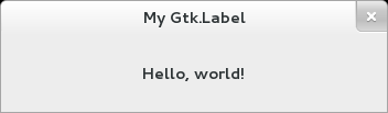
public class Application : Gtk.Window {

	public Application () {
		// Prepare Gtk.Window:
		this.title = "My Gtk.Label";
		this.window_position = Gtk.WindowPosition.CENTER;
		this.destroy.connect (Gtk.main_quit);
		this.set_default_size (350, 70);

		// The Label:
		Gtk.Label label = new Gtk.Label ("<b>Hello, world!</b>");
		label.set_use_markup (true);
		label.set_line_wrap (true);
		this.add (label);
	}

	public static int main (string[] args) {
		Gtk.init (ref args);

		Application app = new Application ();
		app.show_all ();
		Gtk.main ();
		return 0;
	}
}
valac --pkg gtk+-3.0 Gtk.Label.vala