Button
Object Hierarchy:
Description:
public class Button : Bin, Implementor, Actionable, Activatable, Buildable
The Button widget is generally used to trigger a callback function that is called when the button is pressed.
The various signals and how to use them are outlined below.
The Button widget can hold any valid child widget. That is, it can hold almost any other standard Widget. The most commonly used child is the Label.
CSS nodes
GtkButton has a single CSS node with name button. The node will get the style classes .image-button or .text-button, if the content is just an image or label, respectively. It may also receive the .flat style class.
Other style classes that are commonly used with GtkButton include .suggested-action and .destructive-action. In special cases, buttons can be made round by adding the .circular style class.
Button-like widgets like ToggleButton, MenuButton, VolumeButton, LockButton, ColorButton, FontButton or FileChooserButton use style classes such as .toggle, .popup, .scale, .lock, .color, .font, .file to differentiate themselves from a plain GtkButton.
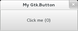
Example: Button:
public class Application : Gtk.Window {
	private int click_counter = 0;

	public Application () {
		// Prepare Gtk.Window:
		this.title = "My Gtk.Button";
		this.window_position = Gtk.WindowPosition.CENTER;
		this.destroy.connect (Gtk.main_quit);
		this.set_default_size (350, 70);

		// The button:
		Gtk.Button button = new Gtk.Button.with_label ("Click me (0)");
		this.add (button);

		button.clicked.connect (() => {
			// Emitted when the button has been activated:
			button.label = "Click me (%d)".printf (++this.click_counter);
		});
	}

	public static int main (string[] args) {
		Gtk.init (ref args);

		Application app = new Application ();
		app.show_all ();
		Gtk.main ();
		return 0;
	}
}
valac --pkg gtk+-3.0 Gtk.Button.vala