The Notebook widget is a Container whose children
are pages that can be switched between using tab labels along one edge.
There are many configuration options for GtkNotebook. Among other things, you can choose on which edge the tabs appear (see
set_tab_pos), whether, if there are too many tabs to fit the notebook
should be made bigger or scrolling arrows added (see set_scrollable),
and whether there will be a popup menu allowing the users to switch pages. (see
popup_enable,
popup_disable)
GtkNotebook as GtkBuildable
The GtkNotebook implementation of the Buildable interface supports placing
children into tabs by specifying “tab” as the “type” attribute of a `<child>` element. Note that the content of the tab must be
created before the tab can be filled. A tab child can be specified without specifying a `<child>` type attribute.
To add a child widget in the notebooks action area, specify "action-start" or “action-end” as the “type” attribute of the `<child
>` element.
An example of a UI definition fragment with GtkNotebook:
<object class="GtkNotebook">
  <child>
    <object class="GtkLabel" id="notebook-content">
      <property name="label">Content</property>
    </object>
  </child>
  <child type="tab">
    <object class="GtkLabel" id="notebook-tab">
      <property name="label">Tab</property>
    </object>
  </child>
</object>
CSS nodes
notebook
├── header.top
│   ├── [<action widget>]
│   ├── tabs
│   │   ├── [arrow]
│   │   ├── tab
│   │   │   ╰── <tab label>
┊   ┊   ┊
│   │   ├── tab[.reorderable-page]
│   │   │   ╰── <tab label>
│   │   ╰── [arrow]
│   ╰── [<action widget>]
│
╰── stack
    ├── <child>
    ┊
    ╰── <child>
hich contains one subnode per tab with name tab.
If action widgets are present, their CSS nodes are placed next to the tabs node. If the notebook is scrollable, CSS nodes with name arrow are
placed as first and last child of the tabs node.
The main node gets the .frame style class when the notebook has a border (see
set_show_border).
The header node gets one of the style class .top, .bottom, .left or .right, depending on where the tabs are placed. For reorderable pages, the
tab node gets the .reorderable-page class.
A tab node gets the .dnd style class while it is moved with drag-and-drop.
The nodes are always arranged from left-to-right, regarldess of text direction.
Example: Notebook:
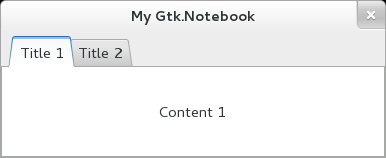
public class Application : Gtk.Window {
	public Application () {
		// Prepare Gtk.Window:
		this.title = "My Gtk.Notebook";
		this.window_position = Gtk.WindowPosition.CENTER;
		this.destroy.connect (Gtk.main_quit);
		this.set_default_size (400, 400);

		// The Notebook:
		Gtk.Notebook notebook = new Gtk.Notebook ();
		this.add (notebook);

		// Tab 1:
		Gtk.Label title = new Gtk.Label ("Title 1");
		Gtk.Label content = new Gtk.Label ("Content 1");
		notebook.append_page (content, title);

		// Tab 2:
		title = new Gtk.Label ("Title 2");
		content = new Gtk.Label ("Content 2");
		notebook.append_page (content, title);
	}

	public static int main (string[] args) {
		Gtk.init (ref args);

		Application app = new Application ();
		app.show_all ();
		Gtk.main ();
		return 0;
	}
}
valac --pkg gtk+-3.0 Gtk.Notebook.vala
- public int append_page (Widget child, Widget? tab_label = null)
Appends a page to this.
- public int append_page_menu (Widget child, Widget? tab_label, Widget? menu_label)
Appends a page to this, specifying the
widget to use as the label in the popup menu.
- public void detach_tab (Widget child)
Removes the child from the notebook.
- public unowned Widget? get_action_widget (PackType pack_type)
Gets one of the action widgets.
- public int get_current_page ()
Returns the page number of the current page.
- public unowned string? get_group_name ()
Gets the current group name for this.
- public unowned Widget? get_menu_label (Widget child)
Retrieves the menu label widget of the page containing child.
- public unowned string? get_menu_label_text (Widget child)
Retrieves the text of the menu label for the page containing child
.
- public int get_n_pages ()
Gets the number of pages in a notebook.
- public unowned Widget? get_nth_page (int page_num)
Returns the child widget contained in page number page_num.
- public bool get_scrollable ()
Returns whether the tab label area has arrows for scrolling.
- public bool get_show_border ()
Returns whether a bevel will be drawn around the notebook pages.
- public bool get_show_tabs ()
Returns whether the tabs of the notebook are shown.
- public bool get_tab_detachable (Widget child)
Returns whether the tab contents can be detached from
this.
- public uint16 get_tab_hborder ()
Returns the horizontal width of a tab border.
- public unowned Widget? get_tab_label (Widget child)
Returns the tab label widget for the page child.
- public unowned string? get_tab_label_text (Widget child)
Retrieves the text of the tab label for the page containing child
.
- public PositionType get_tab_pos ()
Gets the edge at which the tabs for switching pages in the notebook are
drawn.
- public bool get_tab_reorderable (Widget child)
Gets whether the tab can be reordered via drag and drop or not.
- public uint16 get_tab_vborder ()
Returns the vertical width of a tab border.
- public int insert_page (Widget child, Widget? tab_label, int position)
Insert a page into this at the given
position.
- public virtual int insert_page_menu (Widget child, Widget? tab_label, Widget? menu_label, int position)
Insert a page into this at the given
position, specifying the widget to use as the label in the popup menu.
- public void next_page ()
Switches to the next page.
- public int page_num (Widget child)
Finds the index of the page which contains the given child widget.
- public void popup_disable ()
Disables the popup menu.
- public void popup_enable ()
Enables the popup menu: if the user clicks with the right mouse button on
the tab labels, a menu with all the pages will be popped up.
- public int prepend_page (Widget child, Widget? tab_label = null)
Prepends a page to this.
- public int prepend_page_menu (Widget child, Widget? tab_label, Widget? menu_label)
Prepends a page to this, specifying the
widget to use as the label in the popup menu.
- public void prev_page ()
Switches to the previous page.
- public void remove_page (int page_num)
Removes a page from the notebook given its index in the notebook.
- public void reorder_child (Widget child, int position)
Reorders the page containing child, so that it appears in
position position.
- public void set_action_widget (Widget widget, PackType pack_type)
Sets widget as one of the action widgets.
- public void set_current_page (int page_num)
Switches to the page number page_num.
- public void set_group_name (string? group_name)
Sets a group name for this.
- public void set_menu_label (Widget child, Widget? menu_label)
Changes the menu label for the page containing child.
- public void set_menu_label_text (Widget child, string menu_text)
Creates a new label and sets it as the menu label of child.
- public void set_scrollable (bool scrollable)
Sets whether the tab label area will have arrows for scrolling if there are
too many tabs to fit in the area.
- public void set_show_border (bool show_border)
Sets whether a bevel will be drawn around the notebook pages.
- public void set_show_tabs (bool show_tabs)
Sets whether to show the tabs for the notebook or not.
- public void set_tab_detachable (Widget child, bool detachable)
Sets whether the tab can be detached from this
to another notebook or widget.
- public void set_tab_label (Widget child, Widget? tab_label)
Changes the tab label for child.
- public void set_tab_label_text (Widget child, string tab_text)
Creates a new label and sets it as the tab label for the page containing
child.
- public void set_tab_pos (PositionType pos)
Sets the edge at which the tabs for switching pages in the notebook are
drawn.
- public void set_tab_reorderable (Widget child, bool reorderable)
Sets whether the notebook tab can be reordered via drag and drop or not.